Saturday, 14 January 2012

Evaluation 4 (PLAN)

Evaluation 4

How did you use media technologies in the construction and research, planning and evaluation stages?

Construction

To construct the media products (Video, DigiPak and Poster) we had to use a variety of programs. These include:

Final Cut – This was the main tool that we used to edit the film and to put all of the clips together and make the video a professional one. We were able to edit the timing, positioning and length of shots, meaning that we were able to edit the parts that we wanted to and put the parts where we wanted to. Some of the tools that we used in Final Cut were: the razor cutter tool, the in and out markers and the time changer. The razor tool that we used allowed us to cut out certain parts and then if we didn’t think they fit, we could move them around. The in and out markers allowed us to select certain parts, and we could then edit these parts, either with the tools available in Final Cut or the ones in Photoshop.

Photoshop – This was the tool that we used extensively to edit the photos and was the tool that we used to create the digipak, advert and CD for the Ancillary task. It was good because it meant that we were able to change/ add different dimensions to the products, which originally were just pictures from a photo shoot. We used filters, background erasers and filler tools to create this effect. Although we mainly used this for the ancillary tasks it was also useful for the creation of comic effects in the video, for example the bridge between cartoon and reality scenes. To perform this task we had to take stills, frame by frame, and then import them into the program. Once they were in Photoshop we added a filter so that we had a comic effect and then if they needed extra editing this then we would add extra effects. For example we could have added blurs or fades on the pages.

Canon XL2 – This was the camera that we used to film the video and because it was a high quality camera we were able to get professional looking footage. We used this with a tripod, which meant we were able to get steady shots and this meant that the shots we needed didn’t wobble or distort. With this camera we were able to frame a variety of shots, including overhead shots, meat shots, close ups and establishing shots.

To research the media products that we created we used:

YouTube – We used this as a major part of our research into the video part of the eventual media product. We were able to look at similar videos from the same genre and this was able to look at regular conventions and we were then able to add these conventions to our planning stage. We could also look at the original video for this song and look at the themes that the song has had portrayed by the original artists.

Google – Using this popular search engine we were able to pretty much find all of the information that we need to construct a professional media product. It gave us the links to millions of websites and these were what helped us to get ideas and advice on creating the products. This was helpful for all 3 media products; Video, Digipak, Poster.

To plan the media products we used:

We used lots of programs for planning the media products. These included Prezi, Wordle, Blogger, Microsoft Word and Microsoft PowerPoint. Prezi, Wordle and PowerPoint were very good for presenting our ideas, which was good because it meant we could show people and could get early audience feedback. Blogger and Word were more used when we wanted to make a note of our ideas and so that we had somewhere to record it, and could use these as a document of our work and we can see how far the planning went. We had to ensure that our work wasn’t lost in the case of an accident so we always ensured that we had work backed up in a separate folder, meaning that it was highly unlikely that we would lose any work that we had previously created.

To evaluate the media products we used:

Social Networking Sites – Sites like Facebook, Twitter and YouTube were very good to use when we were seeking feedback from our target audience, which was more of a teenage audience and these were the people our channels/ profile would be likely to attract. They were good because it meant that people were able to see the video easily and could comment or ‘like’ it on the sites. This meant we could get feedback and could look at said feedback and possibly change our video if we felt that it was necessary.

Prezi – We used a Prezi to display our evaluation as we felt that it was a good way to display all of the text and pictures that we wanted to and it also meant that we didn’t make it so complicated that it was impossible to read.

Video (Using HD Cameras) – we filmed videos for some of our evaluations so that we were able to visually represent ourselves whilst evaluating our media product. This meant that we could use the studio, with green screen, and this added a different dimension to the evaluation stage.

Class Evaluation - we got people in our class to watch the video and because they were all 17 or 18 years old, they were the perfect audience to use to evaluate. We asked them to watch our video and then look at our ancillary tasks and then asked them to write down what they thought of each text. In a similar way to the social networking sites we could look at this feedback and then decide if it was relevant enough to mean that we needed to make a change. If we had to then we would make this change, usually if it came up a few times on different peoples answers. Once we had done this we could show the same people the video again and then they could add more feedback and this meant we could keep improving it until we had a media product that everyone though was of an excellent standard.

Tuesday, 10 January 2012

DigiPak Ancillary Text Feedback Sheet

A sheet was used to gather further feedback from peers on if the product matches criteria, and any flaws/positives the product has.

Strengths of the ancillary texts so far

  • Great colour scheme that matches the overall products throughout.
  • The shots used relate back to shots present in the video, making a clear connection between the two.
Areas for possible improvement
  • At the time of review, there was little text on the digipak. This is now fixed as the likes of a track-list has been added.
  • More colour was needed to make the digipak stand out from the crowd, so this was reviewed.
How effective is the brand identity
  • The logo relates to the genre it's trying to represent, and is appealing to look at.
  • Consistent throughout the products.
  • The logo is simple and easy to recognise.
Our evaluation of feedback...

We agree with the feedback such as the idea that we need more colour, as this was something we were currently working on. The other weakness mentioned, the lack of text, is not a priority to fix however as the effect of simple & effective was the desired image. The positive feedback has helped cement the idea that some of our products near completion, and that some changes are not required. We will use our remaining time to finalise our products, using aids such as this feedback to shape the overall outcome.

Sunday, 8 January 2012

Additions To Rough Cut


Comic fight Effects


Drawing inspiration from already existing comic fight sequences, we added our own 'pow' effects to cover up the fake contact, and relate back to the underlying comic references throughout the video. An animation path was also added so that the overlaying effect moved with the punches adding more flow. Finally the composite effect 'screen' was used so that the image merged more with the clip, rather than being totally contrasting. 

Independent Frame Tool 


The independent frame tool was used on a end-of-the-scene clip to create a still image, referring again to the comic style. A overlaying image was added and finally a effect was also added to create a more cartoony style to the image.

Addition of Overlaying Images


A running feature throughout the video is the hinting to comic qualities, which helped underpin the idea behind the story. Original images were imported into the timeline of the video and placed over specific clips at designated spots, disappearing and appearing when fitting (ie. lyrical prompts). Some images also had effects added to enable a smoother integration.

Saturday, 7 January 2012

Second Rough Cut - Swedish House Mafia, Save The World


Rough Cut 2 - Who's Gonna Save the World? from Jordan Thornhill on Vimeo.

This is the filming and editing done so far. This rough cut is used to show a work-in-progress and give a brief insight into how the music video will appear and the techniques that will be used. The video also enabled us to experience some of the tools available to us in Final Cut, and gain first-hand knowledge on what beat matching and timing will be like throughout filming and editing. Some of the techniques used are cuts to the beat using audio waveforms, zooming and cutting, beat matching, trimming and a variety of shots (POV, over the shoulder) to create the overall scene.


This has all of the footage that we are likely to use on our final product. It has all of the scenes in it and the only thing that would be left to do will be the special effect editing. Also we need to fix some of the scenes in it and make sure that they all match up and are fit for the purpose we want them to be. Also we need to add some titles and possibly some sort of ending screen to fit the whole story back together.

Second Rough Cut - Feedback From Peers

Positives


  • Lip Syncing and Narrative matched well to the storyline.
  • The thought beats, in the lesson and with the musical instruments, matched well and gave a good effect
  • The studio scenes were shot well and it fitted in well with the rest of the storyline.
  • The footage that matches up to the sweeping pads in the background fitted in well and made sure that the transition from shot to shot was smooth.

Negatives

  • Out of focus shots - these have now been fixed in the video that we expect to be the final one. We have shortened the clip so that it is more controlled and because it was a bit too long, we have added other clips in its place.
  • Black Widescreen Borders - Because we zoomed in on one of the shoots using Final Cut and not a camera the borders disappeared. This was a problem as the whole video was in widescreen. We fixed this by adding two black borders, that we created using Photoshop and then imported into Final Cut to fix the product.
  • Special Effects in fighting - In the fighting scene it was obvious that none of the hits were making contact. This made the video seem unrealistic and unprofessional. However, we had already thought about this and have put in special effects (See previous posts) that will combat this as they will cover this up, as we wanted it to, and also give a more 'Superhero Comic Book' sort of theme. It also takes away the seriousness of the video and makes it more accessible for a wider audience. 

Thursday, 5 January 2012

Rough Cut


This is the filming and editing done so far. This rough cut is used to show a work-in-progress and give a brief insight into how the music video will appear and the techniques that will be used. The video also enabled us to experience some of the tools available to us in Final Cut, and gain first-hand knowledge on what beat matching and timing will be like throughout filming and editing. Some of the techniques used are cuts to the beat using audio waveforms, zooming and cutting, beat matching, trimming and a variety of shots (POV, over the shoulder) to create the overall scene.

The rough cut only contains one main scene (the introduction), therefore around 3 more 'main scenes' are required for the filming to be complete. Further editing is also required, including in this scene, to create a smoother visual experience and add more related flare to the overall video (for example, a title).

Tuesday, 13 December 2011

Photoshop Filter

To get the effect on lots of the pictures we are considering using in the Digipak we used a filter setting, below is the way we did this:

1. Put a picture into Photoshop

2. Choose A Filter to put over it

3. You have a different style of image

4. Add Titles and any other Graphics

This is a simple version of one we could use. Extra graphics would be added to it and it would then have a slick professional feel and it would be a good insert for the Digipak.


Monday, 12 December 2011

DigiPack Ideas (using Photoshop)


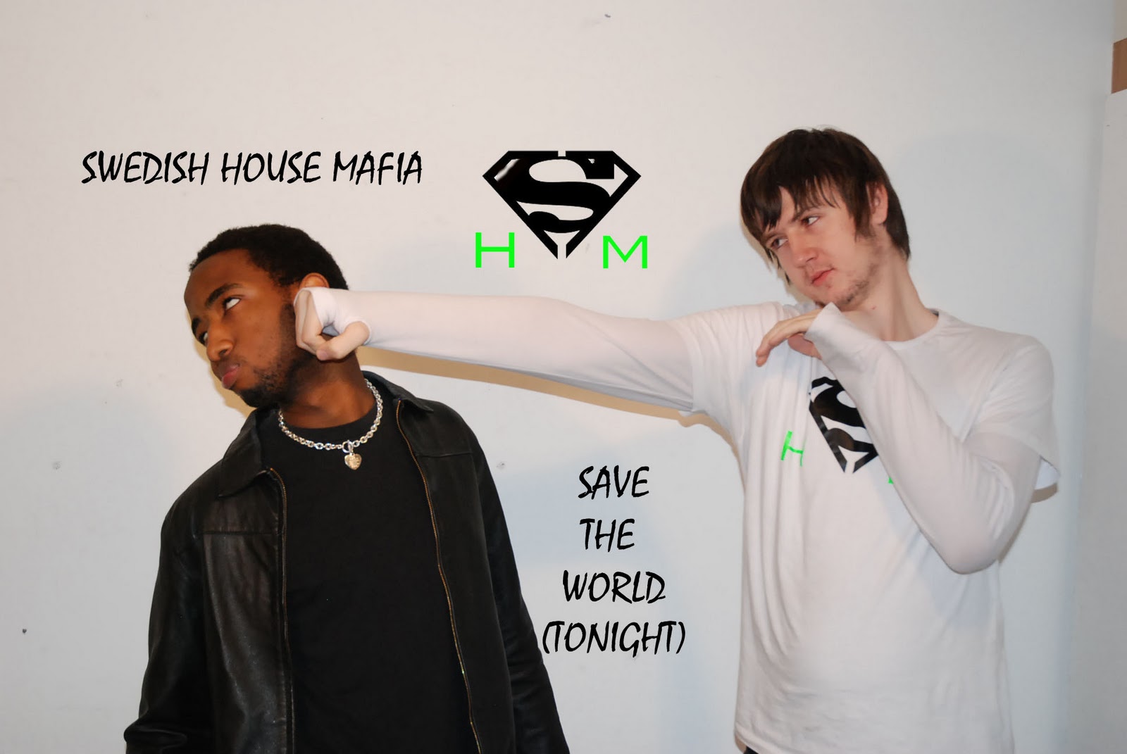
These are some of the ideas that we as a group have had. These are images that could be used on either the actual Digipak, on the CD or as part of a poster or lyrics booklet. They are all shots from a photo shoot that we did with two of the main characters from the music video. The superhero and the criminal from one of the scenes. They have been created using a filter which is available on Photoshop and in some cases using paintbrush/ similar tools to change colours. We have tried to continue with a white, black and green theme, which is the main colour of the hero in the video.